One stop solution for analytics dashboard
It comes with many features and functions that’ll come in handy when extracting data from the databases. During our Dappquery review, we will explain all of the Dappquery features and how to use them.
Dappquery Review And Best Alternatives
In this article, Dappquery review, we’re taking a look at Dappquery as a business-to-business ETH data provider for projects that use ETH tokens.
Since 2015 the ETH blockchain’s creation, there are more than 12,114,684 blocks in the ETH blockchain at the time of writing this article. Also, an average of 200 transactions are recorded per new block that joins the blockchain, as there are more than 1 billion ETH transactions recorded so far.
With all the previous information in mind, we can conclude how hard it is to retrieve on-chain data from the blockchain. However, Dappquery has a one-stop solution; it retrieves data from the blockchain, stores it in databases, and keeps adding new on-chain data.
Not only can you access on-chain data stored in the databases using SQL codes, but you can also visualize on-chain data as charts and export it.
About Dappquery.
Dappquery is a Community-driven analytics platform for ETH that empowers everyone to easily query smart contracts data with Visual SQL.
Also Read: Dune Analytics Review and Best Alternatives.
Dappquery Features.
It comes with many features and functions that’ll come in handy when extracting data from the databases. During our Dappquery review, we will explain all of the Dappquery features and how to use them.
Categorized Metrics.
Dappquery has different categorized metrics that you can view and visualize. Also, you can add any of the metrics to your dashboard.
Smart Contract Data.
A smart contract is a computer program or a transaction protocol intended to execute, automatically control, or document legally relevant events and actions.
Dappquery collects its data from smart contracts and converts it into a human-readable format.
Data Visualisation.
After extracting the data you want, you can choose the best visualization for your data, as Dappquery offers different types of charts.
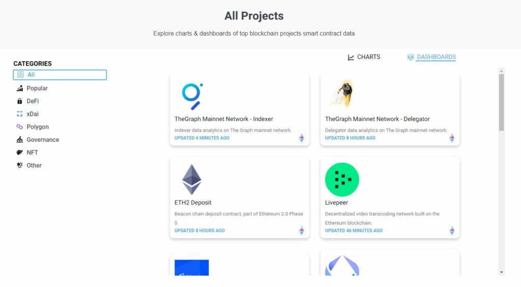
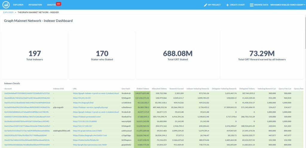
Premade Dashboards.
You don’t need to create a popular dashboard because you can view previously made dashboards by users. You can also share your dashboard via a URL or export it into different files like CSV, XLS and JSON.
Schedule Reports.
You can easily schedule reports for dashboards and charts, and Dappquery will send them to your inbox.
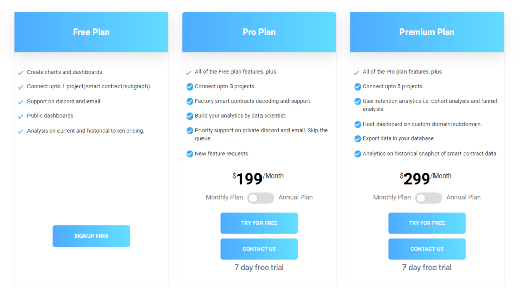
Dappquery Pricing.
Dappquery has different plans for different users with many features. You can see Dappquery plans in the pictures below. Also, you can register for any of the plans here.
Starting with Dappquery.
After creating your account and verifying it with your email, we’ll lead you step-by-step to create and visualize your first chart.
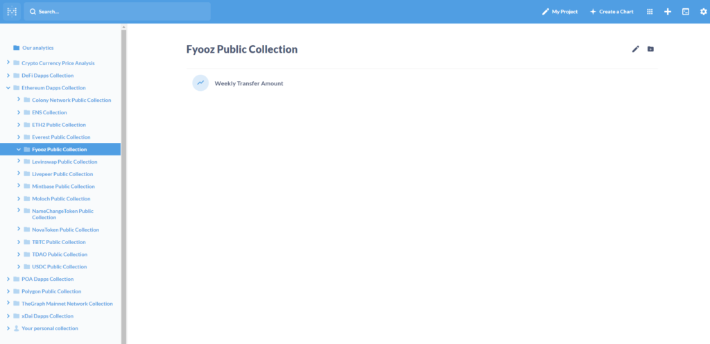
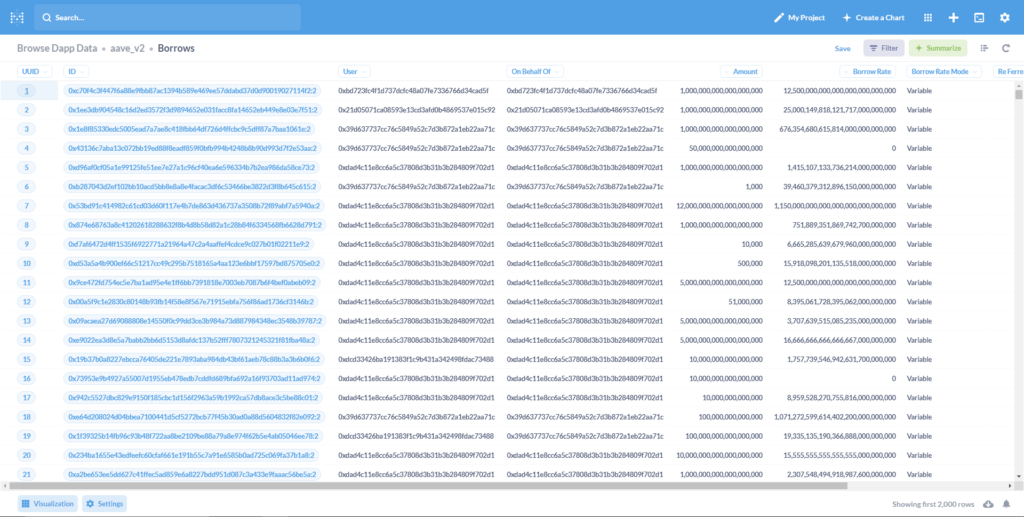
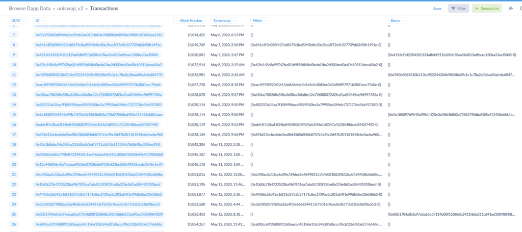
Browse Data.
Firstly, click on ‘Browse Dapp Data’ and then choose the metric you’d like to view.
In this example, we’re going to view transactions made on Uniswap by following this path: uniswap_v2\Transactions.
Now, we can view data within that database, and we’ll teach you how to visualize it in the following step.
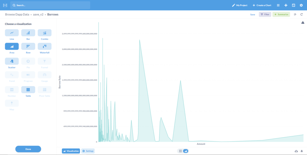
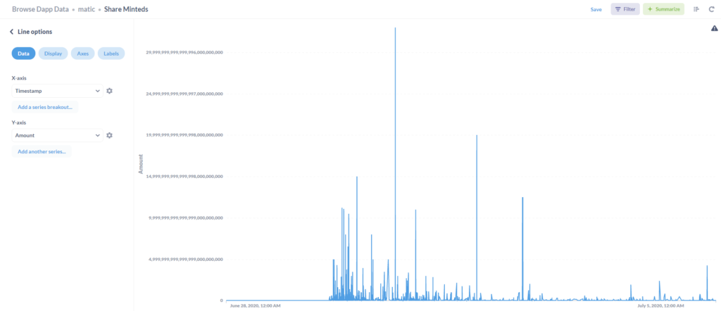
Visualize Data.
For another metric, Matic/Share Minteds. Click on Visualize in the bottom left, then choose the way you want to visualize your chart. After that, you can adjust data on axes X and Y, and then you’ll get your visualized graph that you can add to your dashboard and share.
Dappquery Conclusion.
Dappquery has many tools that you can use to chart on-chain data and visualize graphs. However, there is something that we didn’t like about Dappquery.
Pros.
- Interactive UI
- Excellent pricing
- Premade dashboards
Cons.
- It doesn’t support editing charts